The Behavior Layer: psychology, applied where the customer decides.
People don’t read screens. They decide on them.
Behavior science is the last push that gets people where they meant to go.
I run the Behavior Layer before shipping. Each principle shows the number it moved.

A dial's needle stops just short of its goal; a small nudge pushes it the rest of the way.
The number comes before the principle.
Pricing, policy and the back end pull on every number a screen touches. So I name the number before I design, and measure until the change holds. The four moments that follow open on numbers the business already tracks.
Conversion12% lift in multi-line sales
Multi-line sales rose once each line came up on its own, with the right plan already selected.
Retention2.4× weekly active members in the beta
Members came back for two things: who else was going, and the lap they still had to beat. The event screen leads with both.
Effort31% fewer payment calls
A payment call is a question the screen left open. I closed the common ones where borrowers land.
Completion18% more applications completed
Applicants stalled where the form asked too much at once. I gave each page one topic and kept the finish line in view.
Four plans on one bill, chosen without a spreadsheet.
Mix & Match let every line on a family account pick its own plan. Freedom sells, right up until the customer has to configure it. So I broke one big decision into four small ones.
12% lift in multi-line sales
- Growth.Design: Chunking (opens in a new tab)
What the screen does
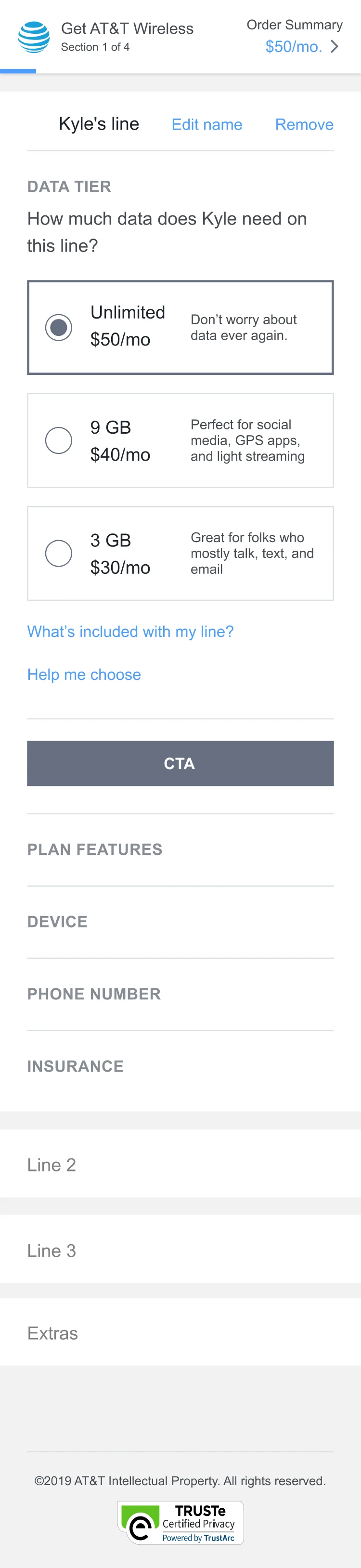
One line at a time. Kyle’s line is open, and Line 2, Line 3 and Extras wait folded below.
Why it works
A family settles one plan before the next one asks for attention.
What moved
28%
fewer plan changes mid-checkout
- Growth.Design: Default bias (opens in a new tab)
What the screen does
Each line opens with the plan I recommend already selected.
Why it works
Most families keep what’s selected, so the default had to be the plan worth keeping.
What moved
70%
kept the recommended plan, up from half
- Growth.Design: Goal gradient (opens in a new tab)
What the screen does
The header reads Section 1 of 4, with a thin bar filling under it and the running total at the right.
Why it works
People speed up as a progress bar fills, and a family two sections from done rarely turns back.
What moved
11%
more people reached checkout
A club app nobody opens is a brochure.
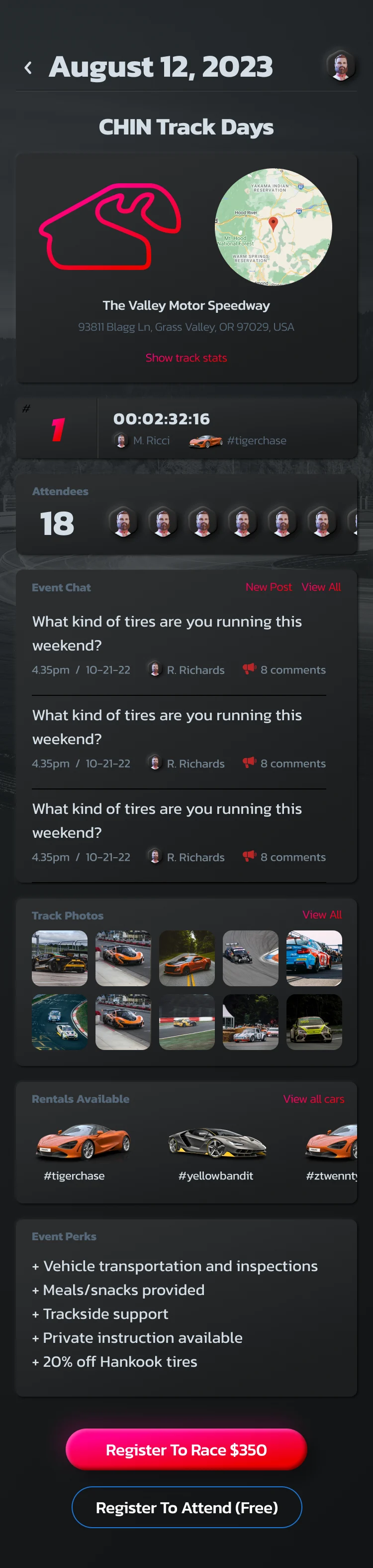
Rafa Racing Club members came for track days, lap times and the company of other drivers. I designed the event screen so a race weekend feels underway before it starts.
2.4× weekly active members in the beta
- Growth.Design: Social proof (opens in a new tab)
What the screen does
The event shows the eighteen members going, each with a face, and photos from the last track day.
Why it works
Members see who is going, so showing up reads as normal.
What moved
23%
more event registrations
- Growth.Design: Goal gradient (opens in a new tab)
What the screen does
Each member’s best lap sits on the event card, next to the time to beat.
Why it works
The closer a member gets to the time to beat, the harder the next race weekend is to skip.
What moved
2×
repeat event bookings
- Growth.Design: Commitment (opens in a new tab)
What the screen does
Members register with one tap, and the price sits on the button.
Why it works
Once members have said yes and paid, turning up is keeping their word.
What moved
33%
fewer no-shows
- Growth.Design: Endowment (opens in a new tab)
What the screen does
Every member’s car carries its own hashtag and a profile its owner fills in.
Why it works
The car on screen already belongs to the member, and nobody leaves their own car half built.
What moved
80%
of members completed a car profile
The right answer, before the phone call.
Borrowers of a national student lender called when the app made them hunt for what they owed. The home screen now ends the hunt.
31% fewer payment calls
- Growth.Design: Visual hierarchy (opens in a new tab)
What the screen does
The amount due is the biggest thing on the screen, and the date is right under it.
Why it works
The question most calls opened with is answered before a tap.
What moved
44%
fewer amount-due questions to support
- Growth.Design: Spark effect (opens in a new tab)
What the screen does
Paying is one yellow button at thumb height.
Why it works
A payment that takes one tap looks as small as it is.
What moved
12%
more on-time payments
- Growth.Design: Feedforward (opens in a new tab)
What the screen does
A card under the amount says what changes next and when: principal and interest begin in April.
Why it works
Borrowers meet the first full bill as news they already had.
What moved
22%
more borrowers set up repayment before their first bill

Apply with your eyes open.
A loan application tests nerve before it tests memory. This one, for the same lender, asks the hard questions in an order people can finish.
18% more applications completed
- Growth.Design: Goal gradient (opens in a new tab)
What the screen does
Step 5 of 6 sits at the top with the bar nearly full, and the heading says so: you’re almost done.
Why it works
Effort climbs when the end is in sight.
What moved
27%
more applicants submitted from the review step
- Growth.Design: Chunking (opens in a new tab)
What the screen does
The whole application comes back as four short groups, each with its own Edit.
Why it works
Nobody rereads a form to check one answer.
What moved
19%
less drop-off between steps
- Growth.Design: Feedforward (opens in a new tab)
What the screen does
A sample loan document sits above the submit button, marked as not final.
Why it works
Applicants see what they’re agreeing to before they agree.
What moved
50%
fewer loan-terms questions after submit

I packaged the pass as a Claude skill.
It grades every screen in a flow against 106 principles and names each one the screen breaks. Drop it into Claude Code or Claude.ai and run it on your own product.
Principles from Growth.Design, the library Dan Benoni and Louis-Xavier Lavoie built.
Have a question?
Ask my AI, SmartyPants.
SmartyPants is AI and can make mistakes.