Everyone can choose their own plan. It’s that simple.
Overview
AT&T was rewriting the wireless playbook — letting every line on a multi-line account pick its own plan. Gone are the days where everyone was forced to share the same wireless plan. That left two parallel design problems: teaching a mental model shift this big, and rebuilding the entire acquisition flow to support it. I led design across both.
Opportunity
Become the first wireless carrier whose acquisition flow lets a family choose the right plan for each line, meeting the needs of their family and monthly budget.
Research & Discovery
I kicked off with a comprehensive audit — our acquisition experience against Verizon’s, the only competitor with mix-and-match already in-market. The audit defined seven specific needs the new experience had to address:
- Lack of familiarity led to confusion in the learn stage
- Plan names were confusing (multiple "Unlimited" plans)
- Discounts were confusing (save more with more lines)
- Price changes throughout the experience reduced trust
- Mixing different features into different plans made decisions slow
- Missing details and confusing layout in the "add a line" review page
- Lengthy and confusing journey to obtain mix-and-match information
Users seek context, guidance, and control.
Solution
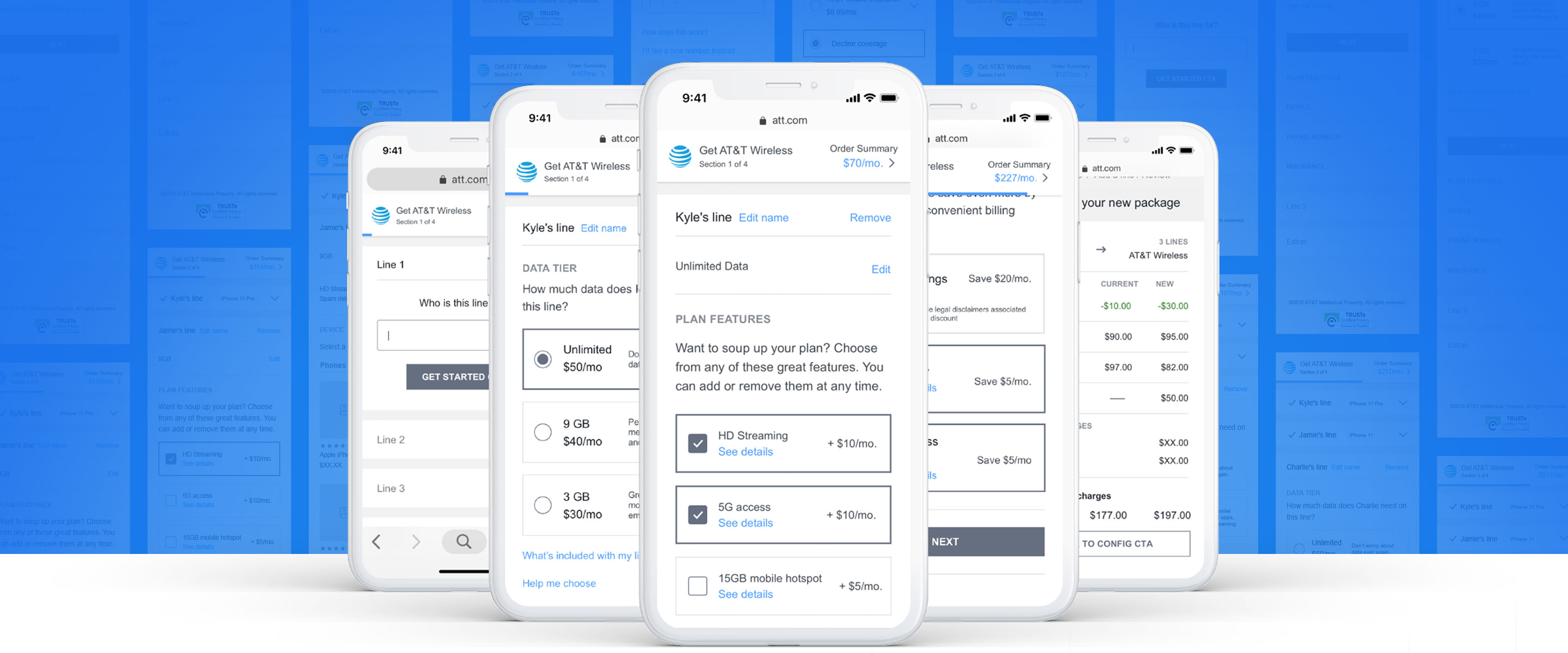
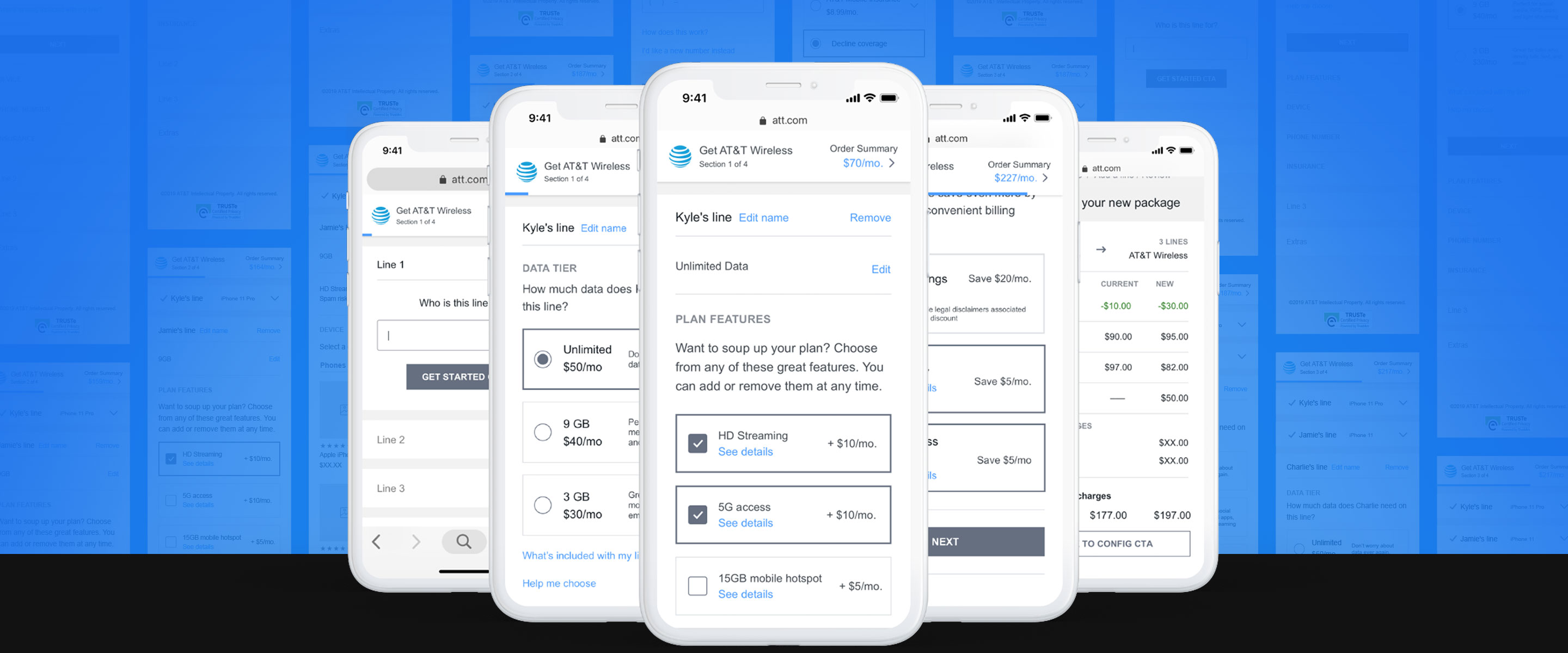
I framed the problem around three user types: net-new customers switching providers, existing customers changing to the new construct, and existing customers adding a line with the option to migrate the rest. Two entry points compounded it — start with a device, or start with a plan. The framework had to handle all six combinations cleanly.
Learn Stage
For the Wireless Plans landing page, we focused on educating users through multiple applications to enhance familiarity with the change and reduce hesitation later in the journey. Research showed users did not understand the term "Mix and Match," so we abstained from marketing buzzwords and used direct language like "You can now add different data options to each line." Real testimonials helped users see benefits through real-life situations, a sample bill reduced surprises, and a rich video reinforced how the new construct delivered value to multi-line accounts.
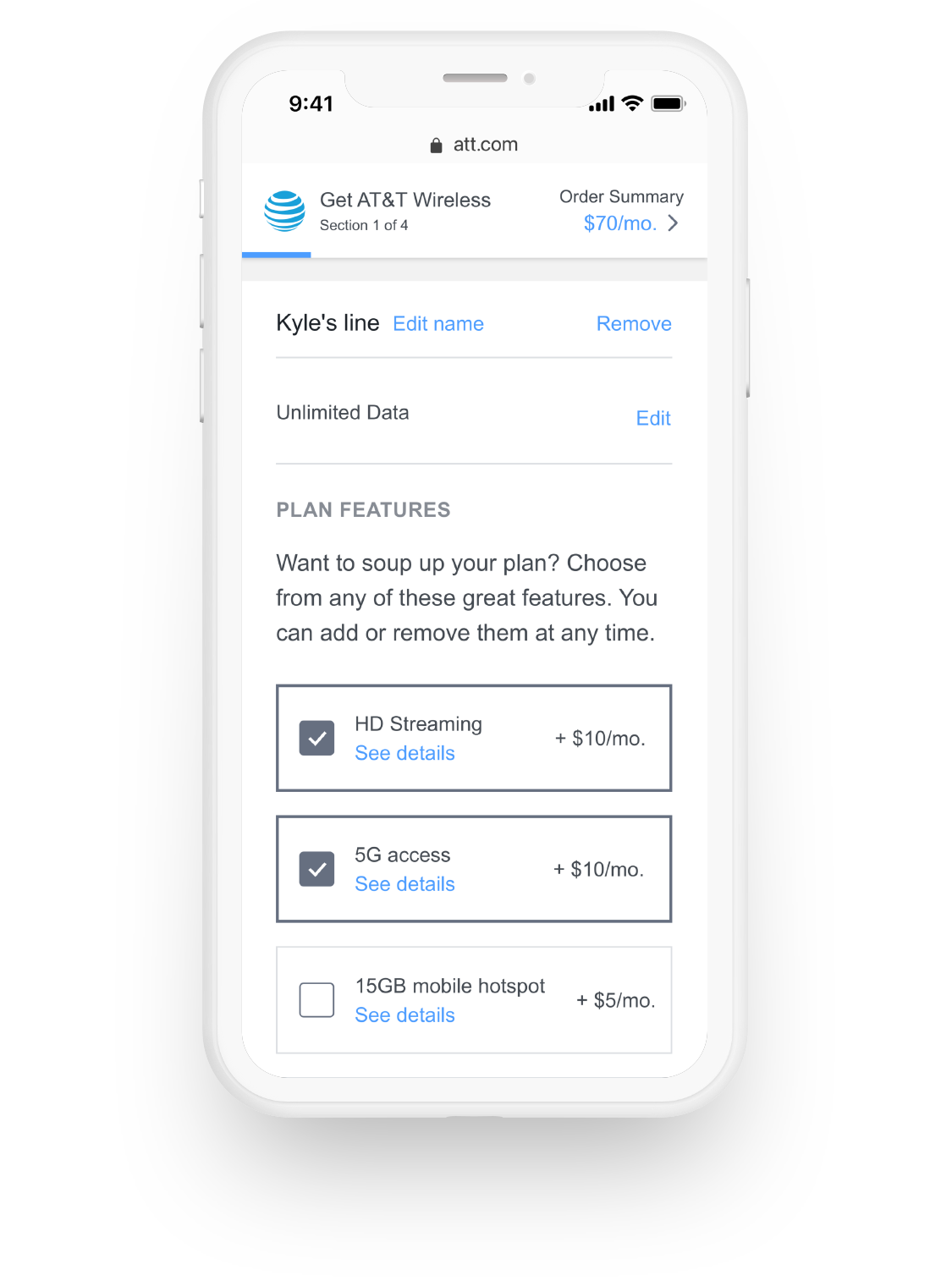
Simplified Pricing
We made a few strategic shifts to simplify decision making, each tied directly to a customer pain point from research:
- Simplified the offering to a single Unlimited plan instead of multiple "unlimited" tiers
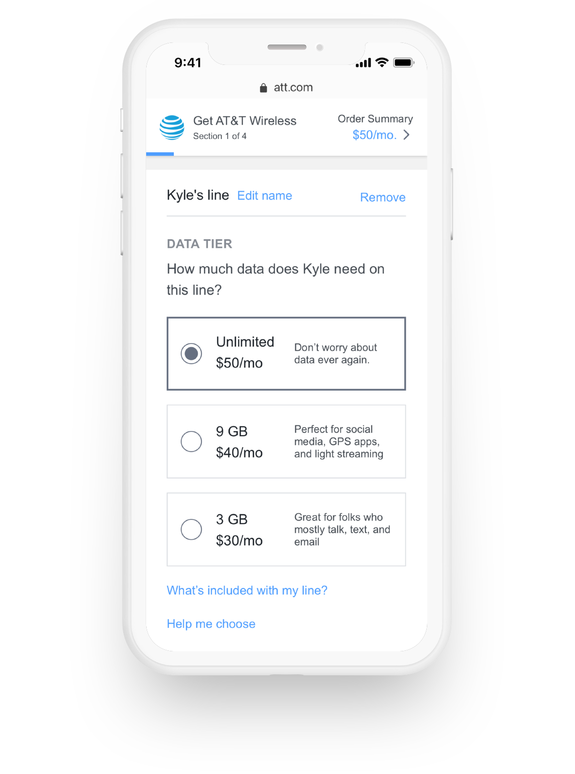
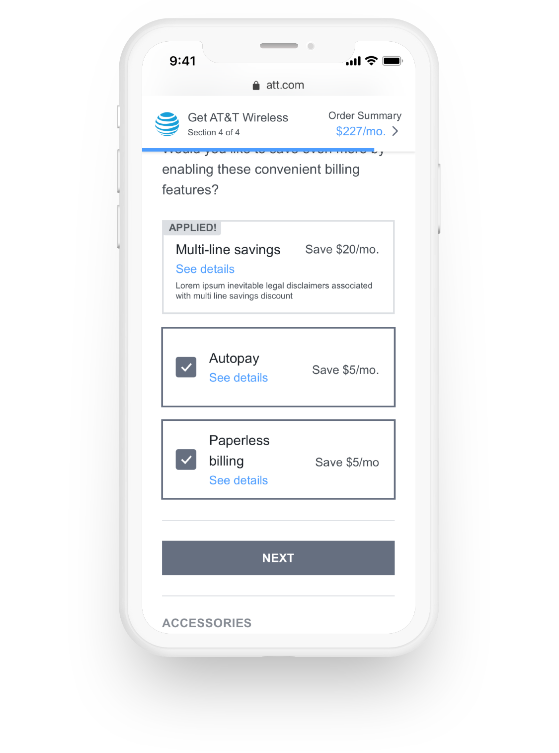
- Moved multi-line discounts onto the bill, not the plan, so per-plan pricing stopped shifting
- Bundled a small set of features into every plan
- Offered the rest of our features à la carte so users only paid for what they wanted
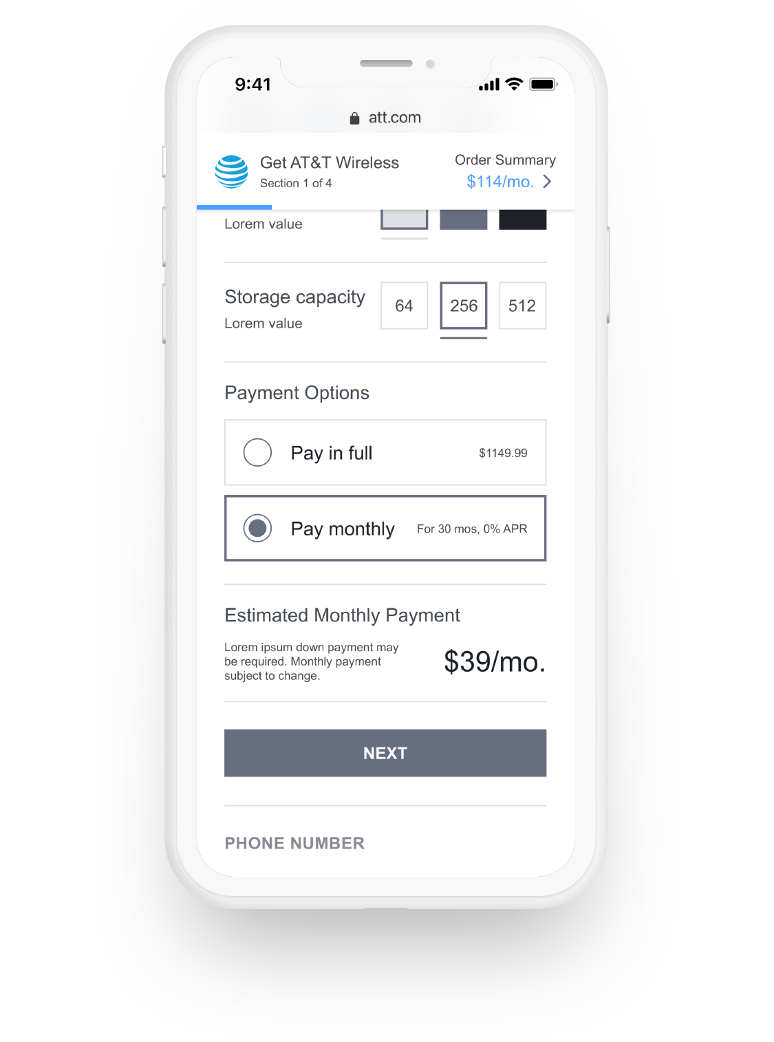
Buy Flow
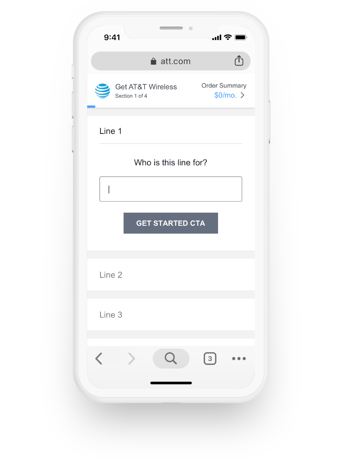
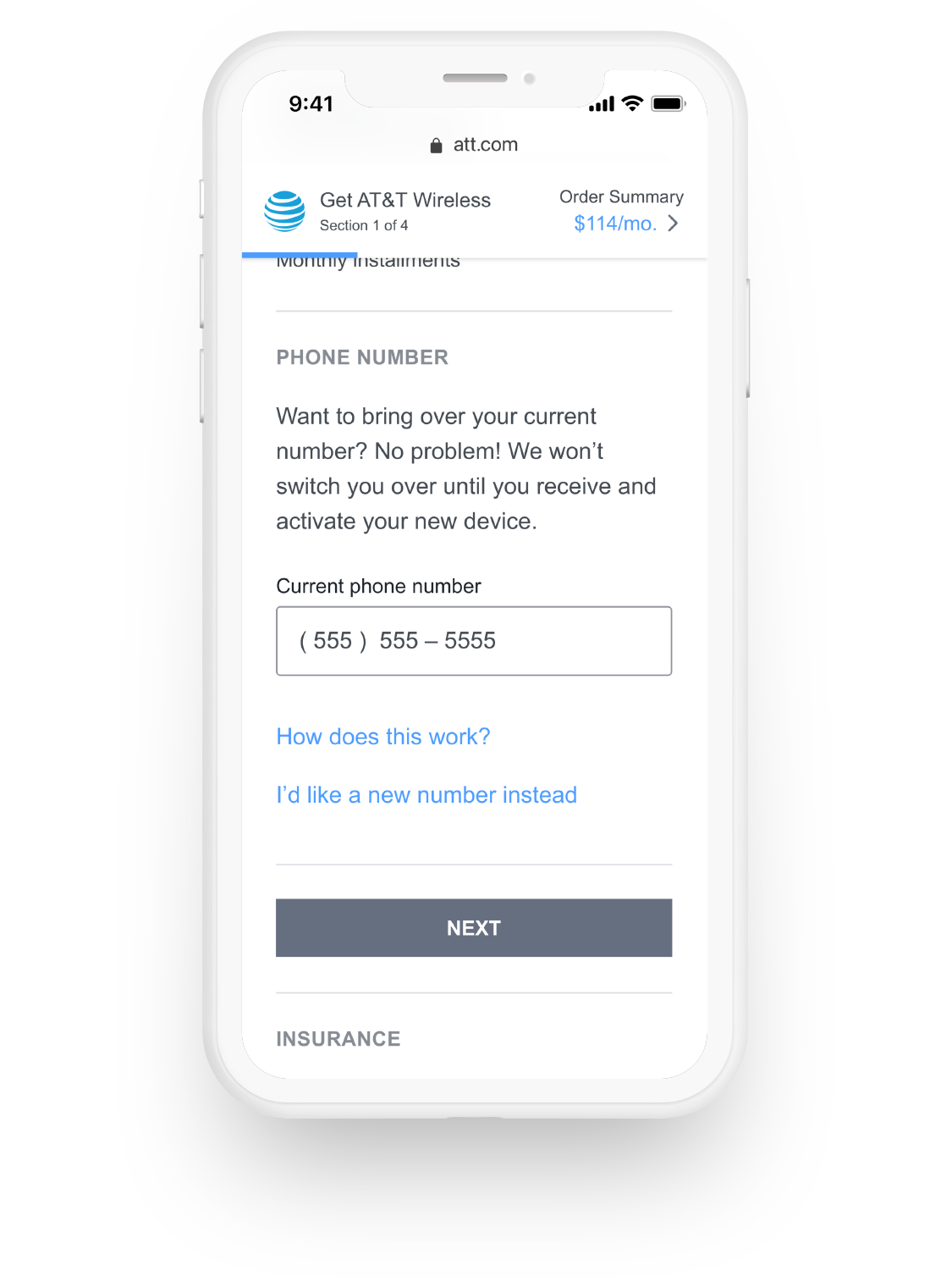
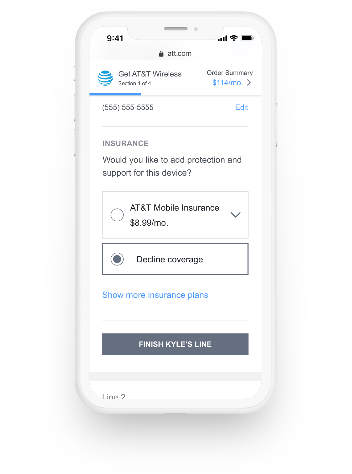
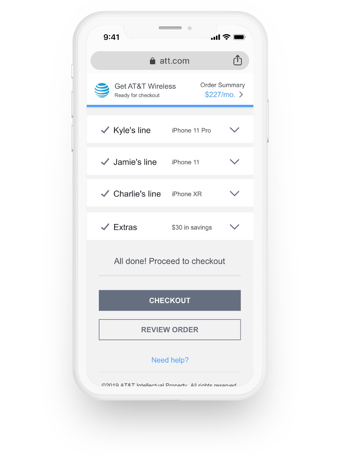
The strategic shift I pushed for was inverting the parent grouping: organize by line, not by decision type. Most flows ask you to pick all plans first, then all devices, then all add-ons. Ours started with “Who’s line is this for?” — humanizing the decision before any product showed up. It also gave the account side a cleaner billing breakdown and made it easier to split financial responsibility across family members. A guided linear flow reduced cognitive load, contextual modals answered common questions in place, and a sticky progress element kept the running total visible so every choice connected back to the cost.
User Testing
By and large, our vision tested well. The most surprising revelation was that although users said they wanted à la carte features, they were initially put off by the offering and assumed it was an upsell — they expected most items to be included. That signal helped us calibrate the threshold between what should ship inside a plan and what should sit alongside it.
Results
The construct shipped to digital, retail, and care. The choose-your-own-line framing became AT&T’s default acquisition pattern for multi-line accounts. Plain-language testing held up: customers stopped asking what "Mix and Match" meant and started asking which plan was right for their kid’s line.